发布日期:2017-09-18 16:01:21
本文收集了CSS实现的基本形状,以及border-radius的文档解释。
border-radius中比较难理解的是由/设置的附加弧度实现椭圆型的边角。
Syntax

The border-radius property is specified as:

1.one, two, three, or four <length> or <percentage> values. This is used to set a single radius for the corners.

2.followed optionally by "/" followed by one, two, three, or four <length> or <percentage> values. This is used to set an additional radius, so you can have elliptical corners.
参考文章:
- https://css-tricks.com/examples/ShapesOfCSS/
- https://developer.mozilla.org/en-US/docs/Web/CSS/border-radius
The Shapes of CSS
All of the below use only a single HTML element. Any kind of CSS goes, as long as it's supported in at least one browser.
Square

#square {
    width: 100px;
    height: 100px;
    background: red;
}
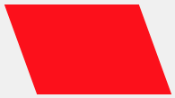
Rectangle

#rectangle {
    width: 200px;
    height: 100px;
    background: red;

}
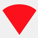
Circle
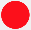
#circle {
    width: 100px;
    height: 100px;
    background: red;
    -moz-border-radius: 50px;
    -webkit-border-radius: 50px;
    border-radius: 50px;
}
/* Cleaner, but slightly less support: use "50%" as value */
Oval

#oval {
    width: 200px;
   height: 100px;
    background: red;
    -moz-border-radius: 100px / 50px;
    -webkit-border-radius: 100px / 50px;
    border-radius: 100px / 50px;
}
/* Cleaner, but slightly less support: use "50%" as value */
Triangle Up
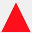
#triangle-up {
    width: 0;
    height: 0;
    border-left: 50px solid transparent;
    border-right: 50px solid transparent;
    border-bottom: 100px solid red;
}
Triangle Down

#triangle-down {
    width: 0;
    height: 0;
    border-left: 50px solid transparent;
    border-right: 50px solid transparent;
    border-top: 100px solid red;
}
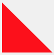
Triangle Left

#triangle-left {
    width: 0;
    height: 0;
    border-top: 50px solid transparent;
    border-right: 100px solid red;
    border-bottom: 50px solid transparent;
}
Triangle Right

#triangle-right {
    width: 0;
    height: 0;
    border-top: 50px solid transparent;
    border-left: 100px solid red;
    border-bottom: 50px solid transparent;
}
Triangle Top Left

#triangle-topleft {
    width: 0;
   height: 0;
    border-top: 100px solid red;
    border-right: 100px solid transparent;
}
Triangle Top Right

#triangle-topright {
    width: 0;
    height: 0;
    border-top: 100px solid red;
    border-left: 100px solid transparent;
}
Triangle Bottom Left
#triangle-bottomleft {
    width: 0;
    height: 0;
    border-bottom: 100px solid red;
    border-right: 100px solid transparent;
}
Triangle Bottom Right

#triangle-bottomright {
    width: 0;
    height: 0;
    border-bottom: 100px solid red;
    border-left: 100px solid transparent;
}
Curved Tail Arrow

#curvedarrow {
  position: relative;
  width: 0;
  height: 0;
 border-top: 9px solid transparent;
  border-right: 9px solid red;
  -webkit-transform: rotate(10deg);
  -moz-transform: rotate(10deg);
  -ms-transform: rotate(10deg);
  -o-transform: rotate(10deg);
}

#curvedarrow:after {
  content: "";
  position: absolute;
  border: 0 solid transparent;
  border-top: 3px solid red;
  border-radius: 20px 0 0 0;
  top: -12px;
  left: -9px;
  width: 12px;
  height: 12px;
 -webkit-transform: rotate(45deg);
  -moz-transform: rotate(45deg);
  -ms-transform: rotate(45deg);
  -o-transform: rotate(45deg);
}
Trapezoid
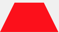
#trapezoid {
    border-bottom: 100px solid red;
    border-left: 50px solid transparent;
    border-right: 50px solid transparent;
    height: 0;
    width: 100px;
}
Parallelogram
#parallelogram {
    width: 150px;
    height: 100px;
    -webkit-transform: skew(20deg);
       -moz-transform: skew(20deg);
         -o-transform: skew(20deg);
    background: red;
}
Star (6-points)

#star-six {
    width: 0;
    height: 0;
    border-left: 50px solid transparent;
    border-right: 50px solid transparent;
    border-bottom: 100px solid red;
    position: relative;
}

#star-six:after {
   width: 0;
    height: 0;
    border-left: 50px solid transparent;
    border-right: 50px solid transparent;
    border-top: 100px solid red;
    position: absolute;
    content: "";
    top: 30px;
    left: -50px;
}
Star (5-points)

#star-five {
   margin: 50px 0;
   position: relative;
   display: block;
   color: red;
   width: 0px;
   height: 0px;
   border-right:  100px solid transparent;
   border-bottom: 70px  solid red;
   border-left:   100px solid transparent;
   -moz-transform:    rotate(35deg);
   -webkit-transform: rotate(35deg);
   -ms-transform:     rotate(35deg);
   -o-transform:      rotate(35deg);
}

#star-five:before {
   border-bottom: 80px solid red;
   border-left: 30px solid transparent;
   border-right: 30px solid transparent;
   position: absolute;
   height: 0;
   width: 0;
   top: -45px;
   left: -65px;
   display: block;
   content: '';
   -webkit-transform: rotate(-35deg);
   -moz-transform:    rotate(-35deg);
   -ms-transform:     rotate(-35deg);
   -o-transform:      rotate(-35deg);
}

#star-five:after {
   position: absolute;
   display: block;
   color: red;
   top: 3px;
   left: -105px;
   width: 0px;
   height: 0px;
   border-right: 100px solid transparent;
   border-bottom: 70px solid red;
   border-left: 100px solid transparent;
   -webkit-transform: rotate(-70deg);
   -moz-transform:    rotate(-70deg);
   -ms-transform:     rotate(-70deg);
   -o-transform:      rotate(-70deg);
   content: '';
}
Pentagon
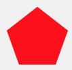
#pentagon {
    position: relative;
    width: 54px;
    border-width: 50px 18px 0;
    border-style: solid;
    border-color: red transparent;
}

#pentagon:before {
    content: "";
    position: absolute;
    height: 0;
    width: 0;
    top: -85px;
    left: -18px;
    border-width: 0 45px 35px;
    border-style: solid;
    border-color: transparent transparent red;

}
Hexagon

#hexagon {
   width: 100px;
    height: 55px;
    background: red;
    position: relative;
}

#hexagon:before {
    content: "";
    position: absolute;
    top: -25px;
    left: 0;
    width: 0;
    height: 0;
    border-left: 50px solid transparent;
    border-right: 50px solid transparent;
    border-bottom: 25px solid red;
}

#hexagon:after {
    content: "";
    position: absolute;
    bottom: -25px;
    left: 0;
    width: 0;
    height: 0;
    border-left: 50px solid transparent;
    border-right: 50px solid transparent;
    border-top: 25px solid red;
}
Octagon
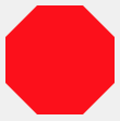
#octagon {
   width: 100px;
    height: 100px;
    background: red;
    position: relative;
}

#octagon:before {
    content: "";
    position: absolute;
    top: 0;
    left: 0;
    border-bottom: 29px solid red;
    border-left: 29px solid #eee;
    border-right: 29px solid #eee;
    width: 42px;
    height: 0;
}
#octagon:after {
    content: "";
    position: absolute;
    bottom: 0;
    left: 0;
    border-top: 29px solid red;
    border-left: 29px solid #eee;
    border-right: 29px solid #eee;
    width: 42px;
    height: 0;
}
Heart

#heart {
    position: relative;
    width: 100px;
    height: 90px;
}
#heart:before,
#heart:after {
    position: absolute;
    content: "";
    left: 50px;
    top: 0;
    width: 50px;
    height: 80px;
    background: red;
    -moz-border-radius: 50px 50px 0 0;
    border-radius: 50px 50px 0 0;
    -webkit-transform: rotate(-45deg);
       -moz-transform: rotate(-45deg);
        -ms-transform: rotate(-45deg);
         -o-transform: rotate(-45deg);
            transform: rotate(-45deg);
    -webkit-transform-origin: 0 100%;
       -moz-transform-origin: 0 100%;
        -ms-transform-origin: 0 100%;
         -o-transform-origin: 0 100%;
            transform-origin: 0 100%;
}

#heart:after {
    left: 0
    -webkit-transform: rotate(45deg);
       -moz-transform: rotate(45deg);
        -ms-transform: rotate(45deg);
         -o-transform: rotate(45deg);
            transform: rotate(45deg);
    -webkit-transform-origin: 100% 100%;
       -moz-transform-origin: 100% 100%;
        -ms-transform-origin: 100% 100%;
         -o-transform-origin: 100% 100%;
            transform-origin :100% 100%;

}
Infinity
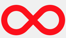
#infinity {
    position: relative;
    width: 212px;
    height: 100px;
}


#infinity:before,
#infinity:after {
    content: "";
    position: absolute;
    top: 0;
    left: 0;
    width: 60px;
   height: 60px;
    border: 20px solid red;
    -moz-border-radius: 50px 50px 0 50px;
         border-radius: 50px 50px 0 50px;
    -webkit-transform: rotate(-45deg);
       -moz-transform: rotate(-45deg);
        -ms-transform: rotate(-45deg);
         -o-transform: rotate(-45deg);
            transform: rotate(-45deg);
}

#infinity:after {
    left: auto;
    right: 0;
    -moz-border-radius: 50px 50px 50px 0;
         border-radius: 50px 50px 50px 0;
    -webkit-transform: rotate(45deg);
      -moz-transform: rotate(45deg);
        -ms-transform: rotate(45deg);
         -o-transform: rotate(45deg);
            transform: rotate(45deg);
}
Diamond Square
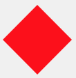
#diamond {
    width: 0;
    height: 0;
    border: 50px solid transparent;
    border-bottom-color: red;
    position: relative;
    top: -50px;
}

#diamond:after {
   content: '';
    position: absolute;
    left: -50px;
    top: 50px;
    width: 0;
    height: 0;
    border: 50px solid transparent;
    border-top-color: red;
}
Diamond Shield

#diamond-shield {
    width: 0;
    height: 0;
    border: 50px solid transparent;
    border-bottom: 20px solid red;
    position: relative;
    top: -50px;
}

#diamond-shield:after {
    content: '';
    position: absolute;
    left: -50px; top: 20px;
    width: 0;
    height: 0;
    border: 50px solid transparent;
    border-top: 70px solid red;
}
Diamond Narrow
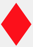
#diamond-narrow {
    width: 0;
    height: 0;
    border: 50px solid transparent;
    border-bottom: 70px solid red;
   position: relative;
   top: -50px;
}

#diamond-narrow:after {
    content: '';
    position: absolute;
    left: -50px; top: 70px;
    width: 0;
    height: 0;
    border: 50px solid transparent;
    border-top: 70px solid red;

}
Cut Diamond
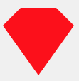
#cut-diamond {
    border-style: solid;
    border-color: transparent transparent red transparent;
    border-width: 0 25px 25px 25px;
    height: 0;
    width: 50px;
   position: relative;
    margin: 20px 0 50px 0;
]

#cut-diamond:after {
    content: "";
    position: absolute;
    top: 25px;
    left: -25px;
    width: 0;
    height: 0;
    border-style: solid;
    border-color: red transparent transparent transparent;
    border-width: 70px 50px 0 50px;
}
Egg
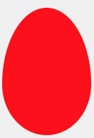
#egg {
   display:block;
   width: 126px;
   height: 180px;
   background-color: red;
   -webkit-border-radius: 63px 63px 63px 63px / 108px 108px 72px 72px;
   border-radius:         50%  50%  50%  50%  / 60%   60%   40%  40%;
}
Pac-Man

#pacman {
  width: 0px;
  height: 0px;
  border-right: 60px solid transparent;
  border-top: 60px solid red;
  border-left: 60px solid red;
  border-bottom: 60px solid red;
  border-top-left-radius: 60px;
  border-top-right-radius: 60px;
  border-bottom-left-radius: 60px;
  border-bottom-right-radius: 60px;
}
Talk Bubble
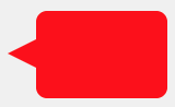
#talkbubble {
   width: 120px;
   height: 80px;
   background: red;
   position: relative;
   -moz-border-radius:    10px;
   -webkit-border-radius: 10px;
   border-radius:         10px;
}

#talkbubble:before {
   content:"";
   position: absolute;
   right: 100%;
   top: 26px;
   width: 0;
   height: 0;
   border-top: 13px solid transparent;
   border-right: 26px solid red;
   border-bottom: 13px solid transparent;
}
12 Point Burst

#burst-12 {
    background: red;
    width: 80px;
    height: 80px;
    position: relative;
    text-align: center;
}

#burst-12:before, #burst-12:after {
    content: "";
    position: absolute;
    top: 0;
    left: 0;
    height: 80px;
    width: 80px;
    background: red;
}

#burst-12:before {
    -webkit-transform: rotate(30deg);
       -moz-transform: rotate(30deg);
        -ms-transform: rotate(30deg);
         -o-transform: rotate(30deg);
}

#burst-12:after {
    -webkit-transform: rotate(60deg);
       -moz-transform: rotate(60deg);
        -ms-transform: rotate(60deg);
         -o-transform: rotate(60deg);

}
8 Point Burst

#burst-8 {
    background: red;
    width: 80px;
    height: 80px;
    position: relative;
    text-align: center;
    -webkit-transform: rotate(20deg);
       -moz-transform: rotate(20deg);
        -ms-transform: rotate(20deg);
         -o-transform: rotate(20eg);
}

#burst-8:before {
    content: "";
    position: absolute;
    top: 0;
    left: 0;
    height: 80px;
    width: 80px;
    background: red;
    -webkit-transform: rotate(135deg);
       -moz-transform: rotate(135deg);
        -ms-transform: rotate(135deg);
         -o-transform: rotate(135deg);
}
Yin Yang
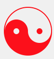
#yin-yang {
    width: 96px;
    height: 48px;
    background: #eee;
    border-color: red;
    border-style: solid;
    border-width: 2px 2px 50px 2px;
    border-radius: 100%;
    position: relative;
}

#yin-yang:before {
   content: "";
    position: absolute;
    top: 50%;
    left: 0;
    background: #eee;
    border: 18px solid red;
    border-radius: 100%;
    width: 12px;
    height: 12px;
}

#yin-yang:after {
    content: "";
    position: absolute;
    top: 50%;
    left: 50%;
    background: red;
    border: 18px solid #eee;
   border-radius:100%;
    width: 12px;
    height: 12px;
}
Badge Ribbon

#badge-ribbon {
 position: relative;
 background: red;
 height: 100px;
 width: 100px;
 -moz-border-radius:    50px;
 -webkit-border-radius: 50px;
 border-radius:         50px;
}

#badge-ribbon:before,
#badge-ribbon:after {
  content: '';
  position: absolute;
  border-bottom: 70px solid red;
  border-left: 40px solid transparent;
  border-right: 40px solid transparent;
  top: 70px;
  left: -10px;
  -webkit-transform: rotate(-140deg);
  -moz-transform:    rotate(-140deg);
  -ms-transform:     rotate(-140deg);
  -o-transform:      rotate(-140deg);
}

#badge-ribbon:after {
  left: auto;
  right: -10px;
  -webkit-transform: rotate(140deg);
  -moz-transform:    rotate(140deg);
  -ms-transform:     rotate(140deg);
  -o-transform:      rotate(140deg);
}
Space Invader
#space-invader{
 box-shadow:
    0 0 0 1em red,
    0 1em 0 1em red,
    -2.5em 1.5em 0 .5em red,
    2.5em 1.5em 0 .5em red,
    -3em -3em 0 0 red,
    3em -3em 0 0 red,
    -2em -2em 0 0 red,
    2em -2em 0 0 red,
    -3em -1em 0 0 red,
    -2em -1em 0 0 red,
    2em -1em 0 0 red,
    3em -1em 0 0 red,
    -4em 0 0 0 red,
    -3em 0 0 0 red,
    3em 0 0 0 red,
    4em 0 0 0 red,
    -5em 1em 0 0 red,
    -4em 1em 0 0 red,
    4em 1em 0 0 red,
    5em 1em 0 0 red,
    -5em 2em 0 0 red,
    5em 2em 0 0 red,
    -5em 3em 0 0 red,
    -3em 3em 0 0 red,
    3em 3em 0 0 red,
    5em 3em 0 0 red,
    -2em 4em 0 0 red,
    -1em 4em 0 0 red,
    1em 4em 0 0 red,
    2em 4em 0 0 red;
    background: red;
    width: 1em;
    height: 1em;
    overflow: hidden;
   margin: 50px 0 70px 65px;
  }
TV Screen

#tv {
  position: relative;
  width: 200px;
  height: 150px;
  margin: 20px 0;
  background: red;
  border-radius: 50% / 10%;
  color: white;
  text-align: center;
  text-indent: .1em;
}

#tv:before {
  content: '';
  position: absolute;
  top: 10%;
  bottom: 10%;
  right: -5%;
  left: -5%;
  background: inherit;
  border-radius: 5% / 50%;
}
Chevron
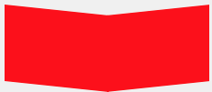
#chevron {
position: relative;
text-align: center;
padding: 12px;
margin-bottom: 6px;
height: 60px;
width: 200px;
}
#chevron:before {
content: '';
position: absolute;
top: 0;
left: 0;
height: 100%;
width: 51%;
background: red;
-webkit-transform: skew(0deg, 6deg);
-moz-transform: skew(0deg, 6deg);
-ms-transform: skew(0deg, 6deg);
-o-transform: skew(0deg, 6deg);
transform: skew(0deg, 6deg);
}
#chevron:after {
content: '';
position: absolute;
top: 0;
right: 0;
height: 100%;
width: 50%;
background: red;
-webkit-transform: skew(0deg, -6deg);
-moz-transform: skew(0deg, -6deg);
-ms-transform: skew(0deg, -6deg);
-o-transform: skew(0deg, -6deg);
transform: skew(0deg, -6deg);
}
Magnifying Glass

#magnifying-glass
{
 font-size: 10em; /* This controls the size. */
 display: inline-block;
 width: 0.4em;
 height: 0.4em;
 border: 0.1em solid red;
 position: relative;
 border-radius: 0.35em;
}

#magnifying-glass::before
{
 content: "";
 display: inline-block;
 position: absolute;
 right: -0.25em;
 bottom: -0.1em;
 border-width: 0;
 background: red;
 width: 0.35em;
 height: 0.08em;
 -webkit-transform: rotate(45deg);
    -moz-transform: rotate(45deg);
     -ms-transform: rotate(45deg);
     -o-transform: rotate(45deg);
}
Facebook Icon

#facebook-icon {
  background: red;
  text-indent: -999em;
  width: 100px;
 height: 110px;
  border-radius: 5px;
position: relative;
  overflow: hidden;
  border: 15px solid red;
  border-bottom: 0;
}

#facebook-icon::before {
  content: "/20";
  position: absolute;
  background: red;
  width: 40px;
  height: 90px;
  bottom: -30px;
  right: -37px;
  border: 20px solid #eee;
  border-radius: 25px;
}

#facebook-icon::after {
  content: "/20";
  position: absolute;
  width: 55px;
  top: 50px;
  height: 20px;
  background: #eee;
  right: 5px;
}
Moon

#moon {
  width: 80px;
  height: 80px;
  border-radius: 50%;
  box-shadow: 15px 15px 0 0 red;
}
Flag

#flag {
  width: 110px;
  height: 56px;
  padding-top: 15px;
  position: relative;
  background: red;
  color: white;
  font-size: 11px;
  letter-spacing: 0.2em;
  text-align: center;
  text-transform: uppercase;
}
#flag:after {
  content: "";
  position: absolute;
  left: 0;
  bottom: 0;
  width: 0;
  height: 0;
  border-bottom: 13px solid #eee;
  border-left: 55px solid transparent;
  border-right: 55px solid transparent;
}
Cone
#cone {
  width: 0;
  height: 0;
  border-left: 70px solid transparent;
  border-right: 70px solid transparent;
  border-top: 100px solid red;
  -moz-border-radius: 50%;
  -webkit-border-radius: 50%;
  border-radius: 50%;
}
Cross
#cross {
  background: red;
  height: 100px;
  position: relative;
  width: 20px;
}

#cross:after {
  background: red;
  content: "";
  height: 20px;
  left: -40px;
  position: absolute;
  top: 40px;
  width: 100px;
}
Base
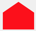
#base {
  background: red;
  display: inline-block;
  height: 55px;
  margin-left: 20px;
  margin-top: 55px;
    position: relative;
    width: 100px;
}
#base:before {
  border-bottom: 35px solid red;
  border-left: 50px solid transparent;
  border-right: 50px solid transparent;
  content: "";
  height: 0;
  left: 0;
  position: absolute;
  top: -35px;
  width: 0;
}