发布日期:2017-09-15 14:40:58
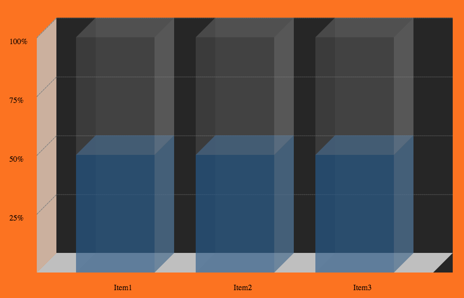
学习css3的作业之一,制作一个简单的图表。
这里是源码和效果图。
参考文档:https://tympanus.net/Tutorials/Animated3DBarChart/
CSS源码:
 @media screen and (max-width: 450px) {
            .sm-graph-container {
                font-size: 0.22em;
            }
        }

        @media screen and (max-width: 630px){
            .sm-graph-container {
                font-size: 0.32em;
            }
        }

        @media screen and (max-width: 720px){
            .sm-graph-container {
                font-size: 0.45em;
            }
        }

        @media screen and (max-width: 765px){
            .sm-graph-container {
                font-size: 0.5em;
            }
        }
        @media screen and (max-width: 1050px){
            .sm-graph-container {
                font-size: 0.6em;
            }
        }

        @media screen and (max-width: 1125px){
            .sm-graph-container {
                font-size: 0.7em;
            }
        }

        .sm-graph-container{
            position: relative;
            background-image: -webkit-linear-gradient(left , rgba(255, 255, 255, .3) 100%, transparent 100%);
            background-image: -moz-linear-gradient(left , rgba(255, 255, 255, .3) 100%, transparent 100%);
            background-image: -o-linear-gradient(left , rgba(255, 255, 255, .3) 100%, transparent 100%);
            background-image: -ms-linear-gradient(left , rgba(255, 255, 255, .3) 100%, transparent 100%);
            background-image: linear-gradient(left , rgba(255, 255, 255, .3) 100%, transparent 100%);
            margin:40px 0 0 40px;
            display: inline-block;
            background:#222;
            padding:0;
        }

        .sm-graph-container *{
            -webkit-box-sizing: border-box;
            -moz-box-sizing: border-box;
            box-sizing: border-box;
        }

        .sm-graph-container:before{
            position:absolute;
            content:"";
            width:100%;
            bottom:0;
            height:2.5em;
            left:-1.25em;
            display:block;
            background-color:rgba(183,183,183,1);
            transform:skew(-45deg);
        }

        .sm-graph-container:after {
            position: absolute;
            content: "";
            width: 2.5em;
            height: 30em;
            left: -2.5em;
            top: 1.25em;

            background-color:rgba(183,183,183,.8);
            -webkit-transform: skew(0deg, -45deg);
            -moz-transform: skew(0deg, -45deg);
            -o-transform: skew(0deg, -45deg);
            -ms-transform: skew(0deg, -45deg);
            transform: skew(0deg, -45deg);
            z-index:-1;
        }

        .sm-graph-container > li{
            display: inline-block;
            position:relative;
            vertical-align: bottom;
        }

        .sm-graph-container > li:first-child{
            margin-left:2.5em;
        }

        .sm-graph-container > li:nth-last-child(2){
            margin-right:2.5em;
        }

        .sm-graph-container > li > span{
            position:absolute;
            width:80%;
            left:0;
            text-align: center;
            bottom:-2.5em;
        }

        .sm-graph-container > li:last-child{
            position:absolute;
            top:0;
            left:0;
            display:block;
            width:100%;
            height:100%;
        }

        .bar-wrapper{
            overflow: hidden;
        }

        .bar-container{
            position:relative;
            width:12.5em;
            height:30em;
            margin-right:2.5em;
            margin-top:2.5em;
        }
        .bar-background{
            position: absolute;
            width: 10em;
            height: 30em;
            top: -2.5em;
            left: 2.5em;
            z-index: 1;
            background-color:rgba(160,160,160,0.1);
        }

        .bar-background:before{
            content:"";
            position: absolute;
            width: 10em;
            height: 2.5em;
            left:-1.25em;
            bottom:-2.5em;
            -webkit-transform: skew(-45deg);
            -moz-transform: skew(-45deg);
            -ms-transform: skew(-45deg);
            -o-transform: skew(-45deg);
            transform: skew(-45deg);
            z-index: 1;
            background-color:rgba(160,160,160,0.2);
        }

        .bar-background:after{
            content:"";
            position: absolute;
            width: 2.5em;
            height: 100%;
            left:-2.5em;
            top:1.25em;
            -webkit-transform: skew(0,-45deg);
            -moz-transform: skew(0,-45deg);
            -ms-transform: skew(0,-45deg);
            -o-transform: skew(0,-45deg);
            transform: skew(0,-45deg);
            z-index: 1;
            background-color:rgba(160,160,160,0.05);
        }

        .bar-inner{
            position: absolute;
            width: 10em;
            height: 15em;
            bottom:0;
            z-index: 3;
            background-color:rgba(5, 62, 123, .6);
            -webkit-transition: height ease-out 3s;
            -moz-transition: height ease-out 3s;
            -ms-transition: height ease-out 3s;
            -o-transition: height ease-out 3s;
            transition: height ease-out 3s;
        }

        .bar-inner:hover{
            background-color:rgba(161,160,0,1);
        }

        .bar-inner:before, .bar-inner:after{
            position: absolute;
            content:"";
        }

        .bar-inner:before{
            width:10em;
            height: 2.5em;
            -webkit-transform: skew(-45deg);
            -moz-transform: skew(-45deg);
            -ms-transform: skew(-45deg);
            -o-transform: skew(-45deg);
            transform: skew(-45deg);
            background-color:rgba(47, 83, 122, .7);
            top:-2.5em;
            left:1.25em;
        }

        .bar-inner:after{
            width:2.5em;
            height: 100%;
            right:-2.5em;
            top:-1.25em;
            -webkit-transform: skew(0,-45deg);
            -moz-transform: skew(0,-45deg);
            -ms-transform: skew(0,-45deg);
            -o-transform: skew(0,-45deg);
            transform: skew(0,-45deg);
            background-color:rgba(5, 62, 123, .6);
        }

        .bar-foreground{
            position: absolute;
            width: 10em;
            height: 100%;
            z-index: 3;
            background-color:rgba(160,160,160,0.1);
        }

        .bar-foreground:before, .bar-foreground:after{
            position: absolute;
            content:"";
        }

        .bar-foreground:before{
            width:2.5em;
            height:30em;
            top:-1.25em;
            right:-2.5em;
            z-index:3;
            background-color:rgba(160,160,160,0.27);
            -webkit-transform: skew(0,-45deg);
            -moz-transform: skew(0,-45deg);
            -ms-transform: skew(0,-45deg);
            -o-transform: skew(0,-45deg);
            transform: skew(0,-45deg);
        }

        .bar-foreground:after{
            width:10em;
            height:2.5em;
            top:-2.5em;
            left:1.25em;
            background-color: rgba(160,160,160,0.2);
            z-index:3;
            -webkit-transform: skew(-45deg);
            -moz-transform: skew(-45deg);
            -ms-transform: skew(-45deg);
            -o-transform: skew(-45deg);
            transform: skew(-45deg);
        }

        .y-axis{
            position: absolute;
            top:0;
            left:0;
            z-index:0;
            display: block;
            width: 100%;
            height: 30em;
        }

        .y-axis>li{
            display:block;
            height:25%;
            width:100%;
            position:absolute;
            left:0;
        }

        .y-axis>li:before, .y-axis>li:after{
            content:"";
            position:absolute;

        }

        .y-axis>li:before{
            width:2.5em;
            left:-2.5em;
            top:1.25em;
            -webkit-transform: skew(0, -45deg);
            -moz-transform: skew(0, -45deg);
            -ms-transform: skew(0, -45deg);
            -o-transform: skew(0, -45deg);
            border-style: none none dotted;
            border-color: rgba(100, 100, 100, 0.7);
            border-width: 0 0 .15em;
            background: rgba(133, 133, 133, 0.7);
        }

        .y-axis>li:after{
            width:100%;
            left:0;
            border-style: none none dotted;
            border-color: rgba(100, 100, 100, .15);
            border-width: 0 0 .15em;
            background: rgba(133, 133, 133, .15);
        }

        .y-axis>li>span{
            position:absolute;
            display: block;
            left:-6em;
            top:2.5em;
            z-index:3;
        }
HTML源码:
<ul class="sm-graph-container">
            <li>
                <span>Item1</span>
                <div class="bar-wrapper">
                    <div class="bar-container">
                        <div class="bar-background">
                        </div>
                        <div class="bar-inner">
                        </div>
                        <div class="bar-foreground">
                        </div>
                    </div>
                </div>
            </li>


            <li>
                <span>Item2</span>
                <div class="bar-wrapper">
                    <div class="bar-container">
                        <div class="bar-background">
                        </div>
                        <div class="bar-inner">
                        </div>
                        <div class="bar-foreground">
                        </div>
                    </div>
                </div>
            </li>

            <li>
                <span>Item3</span>
                <div class="bar-wrapper">
                    <div class="bar-container">
                        <div class="bar-background">
                        </div>
                        <div class="bar-inner">
                        </div>
                        <div class="bar-foreground">
                        </div>
                    </div>
                </div>
            </li>

            <li>
                <ul class="y-axis">
                    <li style="bottom:75%;"><span>100%</span></li>
                    <li style="bottom:50%;"><span>75%</span></li>
                    <li style="bottom:25%;"><span>50%</span></li>
                    <li style="bottom:0;"><span>25%</span></li>
                </ul>
            </li>
        </ul>